The GB "Inspo Roadie" Bus Design Journey
For an insight to the design process and products selected for the GB "Inspo Roadie" bus, check out Alex Fulton's blog.
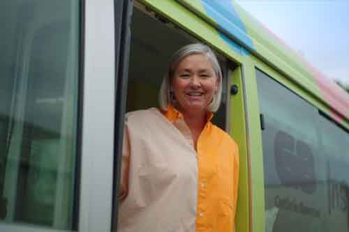
Hello, I’m Alex Fulton, Interior Design and Creative Director for Alex Fulton Design.
I have been involved in the design industry for the past 18 years and I completely love it. It’s a world that I can indulge in my love of all things interiors. I have worked on many different projects over the years from renovations, commercial projects, new builds, magazine styling, collaborative work, concept design, writing, judging, artwork and everything in between. Underlining all these ventures is always colour and good design. They are the two corner stones of everything I do.
Colour is the lens through which I view the world. Colour makes me curious as it creates a connection with a deep side of us which personalises a space and a home. Combinations of colour and how they work together also really spin my wheels and the unexpected alchemy this can create has led me to use them in all sorts of places and spaces. Being analytical about colour can help to bring together a cohesive design plan, to tell a story and set the scene for forming some interior magic.
Hand in hand with colour, good design is essential to my work. Good design doesn’t necessarily mean expensive, rather I like to define it by its design story. Who designed it? What was the design process? Will it be functional? How will it sit in its intended space? All little checks that contribute to the interior story you are trying to tell.
It's combining these two elements together that is the backbone to what I do and how I do it. It’s getting a balance of both just right, so that it makes a house into a home, and gives the people that live or work in these spaces a fully formed design story. The combination of functionality and aesthetic should be both considered and effortless.
Being asked to design the interior of a bus for Guthrie Bowron was a challenge I was more than happy to take on. These might have been the smallest spaces I have designed to date, but this project was big on joy. It’s not every day you get free reign to choose “whatever you think” for a kitchen and living space – made all the better by the product ranges supplied by Guthrie Bowron. Their extensive offerings are like a giant chocolate box of fabrics, finishes, window treatments, wallpapers, floor coverings and paint.

To help me start and to give me the blueprint for the design, I sat down and worked out a colour palette. This gave me the framework to then make product choices. Doing this provides such a good guide, as I wanted each choice to make sense and equally fit into the space with a clear and purposeful design narrative.
In the bus, I had three distinct areas that I wanted to define – the kitchen, the living area and the lounge spaces. As each area is small and unconventional, I decided to use two tones of colour to define each space.
• Kitchen – Greens (Dulux Pukekura Park and Martins Creek)
• Living – Blues (Dulux Tinopai and North Cape)
• Lounge – Pinks (Dulux Aro Street and Ponsonby)
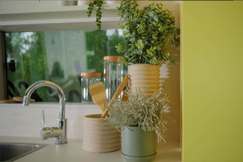
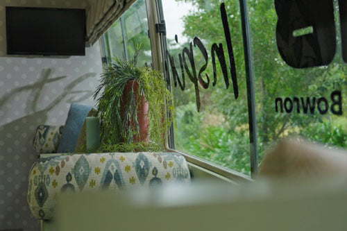
By narrowing the palette for each, it gave me a considered framework to work in with products. For example, the bench seat that runs the length of the kitchen and living area has fabric chosen from the green and blue colour palette in different textures, patterns and shades. In the kitchen, the bench features more green tones, and where it merges to the living area the blues are introduced. Although it’s all one space, the use of colour has helped the brain acknowledge that there are two distinct areas (albeit very small!). The lounge area was a little easier to define as there is a doorway that separates the two spaces, but again, using the pink palette creates a new adventure for a different space.
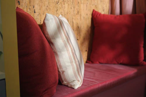
Choosing products then becomes an extension of the considered colour palette and I chose some fun grey and white checked lino for the kitchen and living spaces, and a beautiful woollen Bremworth carpet in a sandy shade to complement the pink tones of the lounge area. For the window treatments, I went with white Luxaflex blinds to match the whitewash of the ceiling detail and to balance interior accessories such as vases and kitchen condiments. It all works well and gives each space its own personality and story.
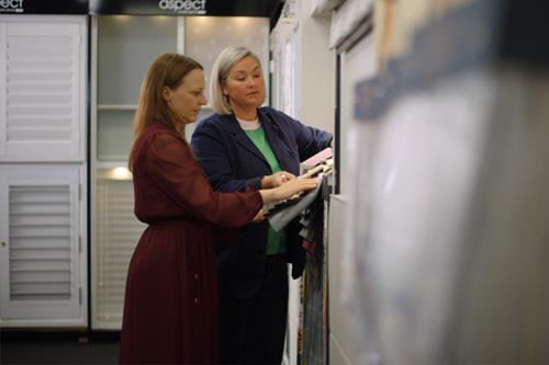
Getting to choose all these products under the one roof of a Guthrie Bowron store is a dream. They not only offer a huge range of products, but they also have such knowledgeable staff to help you make decisions. They are on hand to give you advice on where to use certain finishes, benefits of one product over another and anything you might think of. When it comes to creating your perfect space, trust me, there are no ‘silly questions’!
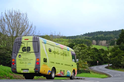
I really hope you will be able to check out the bus in person when it travels around New Zealand on the Guthrie Bowron Road Trip"Inspo Roadie" – it’s like a mobile snapshot of how you can pick and choose from the amazing range of everything and anything you might need to design the spaces you want in your home. Be inspired!
View the full list of Guthrie Bowron products used in the "Inspo Roadie" bus here
Article By:
Alex Fulton
Interior Design and Creative Director for Alex Fulton Design
@helloalexfulton
http://www.alexfultondesign.com/